Project
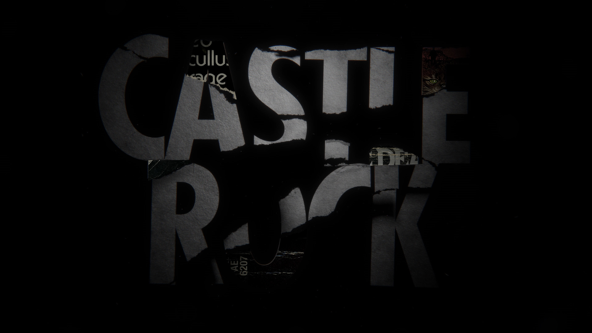
Castle Rock — Title Design 17-5
Enter The Stephen King universe with the mastermind behind the King stories.
Info
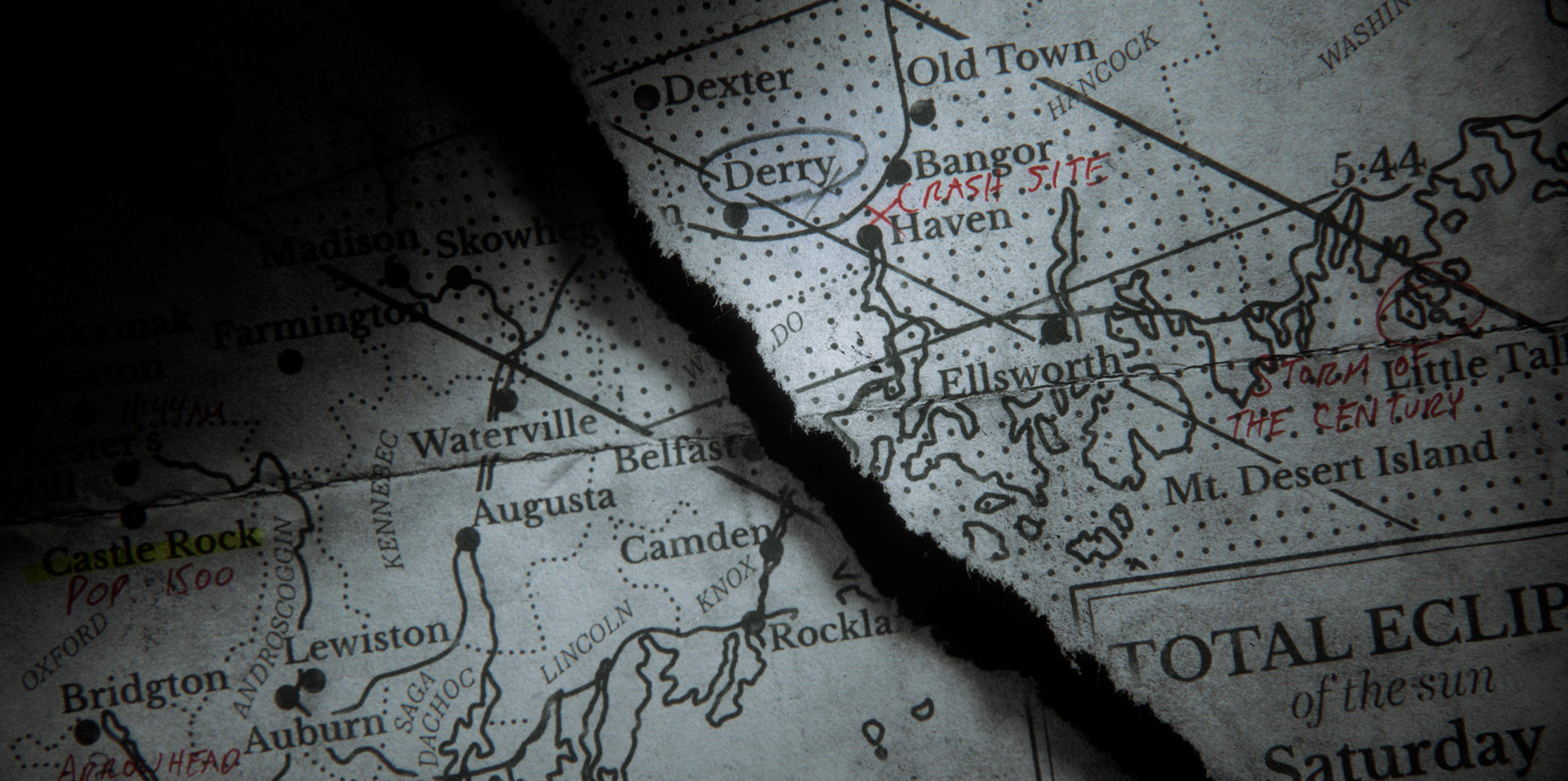
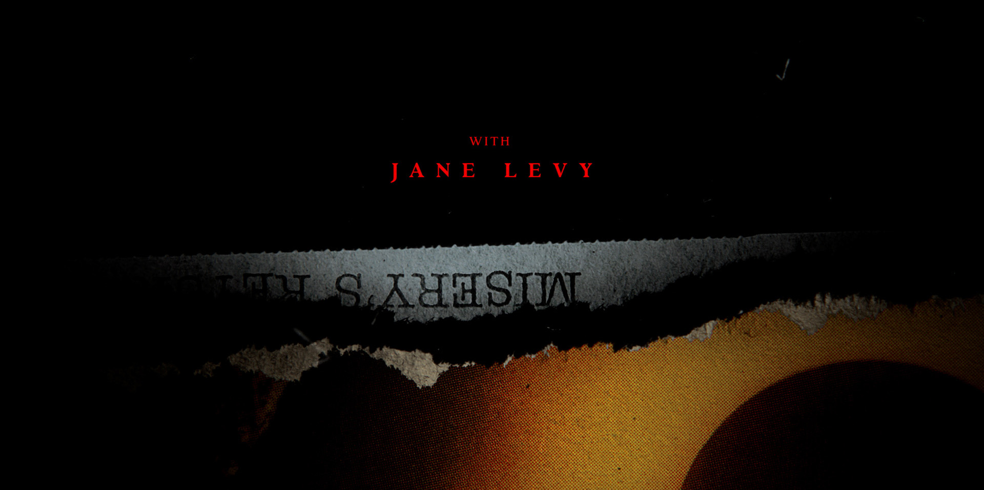
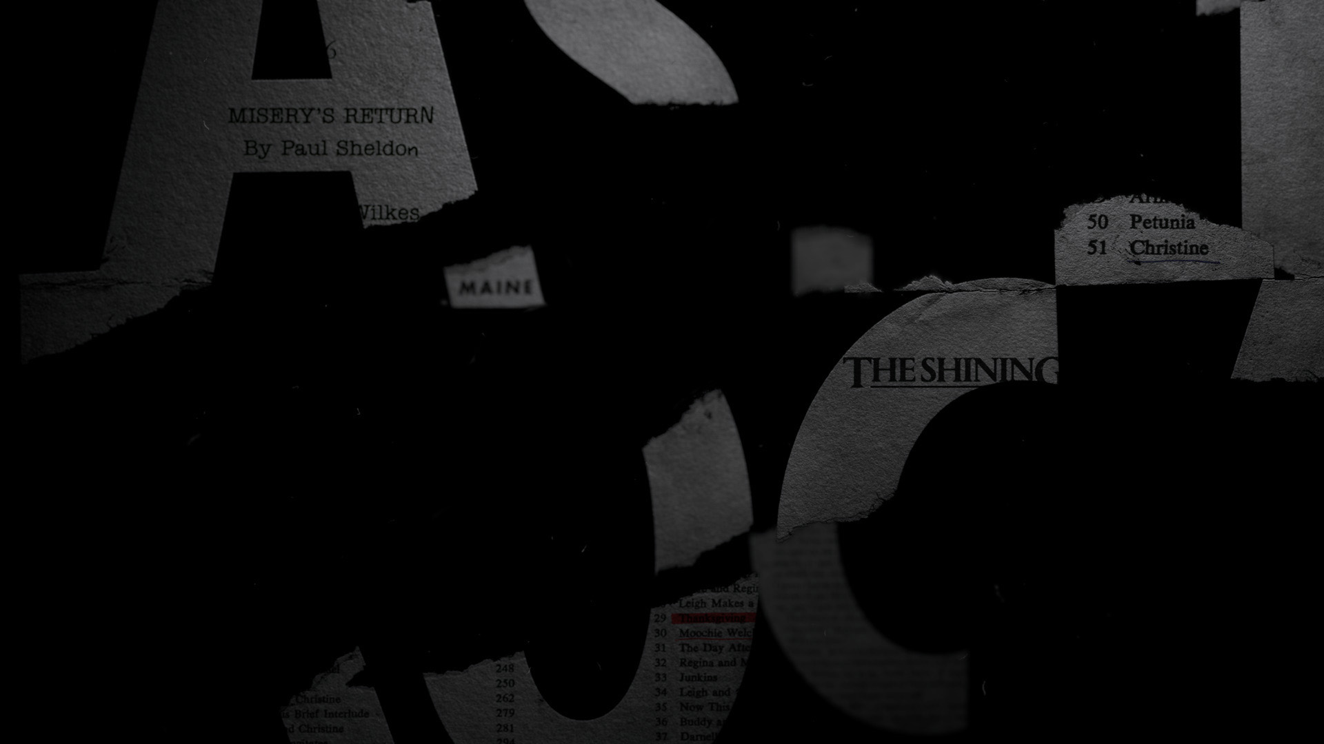
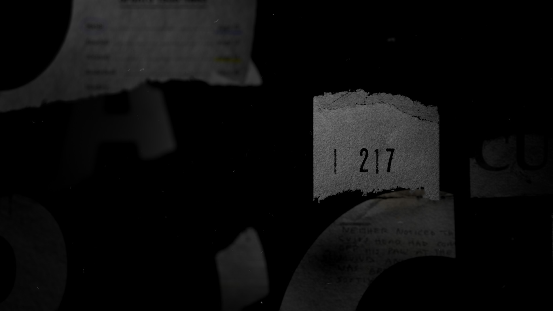
Working closely with the show creators, we sourced physical copies of cover art and pages from King’s original novels and selected a swath of excerpts that allude to the secrets of Castle Rock. We then pieced together scanned elements with sections of the town’s map, and sprinkled in easter eggs from the books and the series that resolve into the show’s logo. Can you piece together the mysteries of the Castle Rock main title?
Role
CONCEPT DEVELOPING
Design
R&D
Motion
Client


creative director: alan williams producer: aleen kim art director: max strizich designers: max strizich, henry chang, clint chang, sam alexander animators: max strizich, rick kuan, hogan williams, henry chang editor: jeremiah shuff compositors: max strizich, rick kuan, henry chang copywriters: bo bishop, loren schiller storyboard artist: wes simpkins head of production: aleen kim associate producer: meredith engstrom executive producer: jon hassell

↓ EARLY STYLEFRAMES


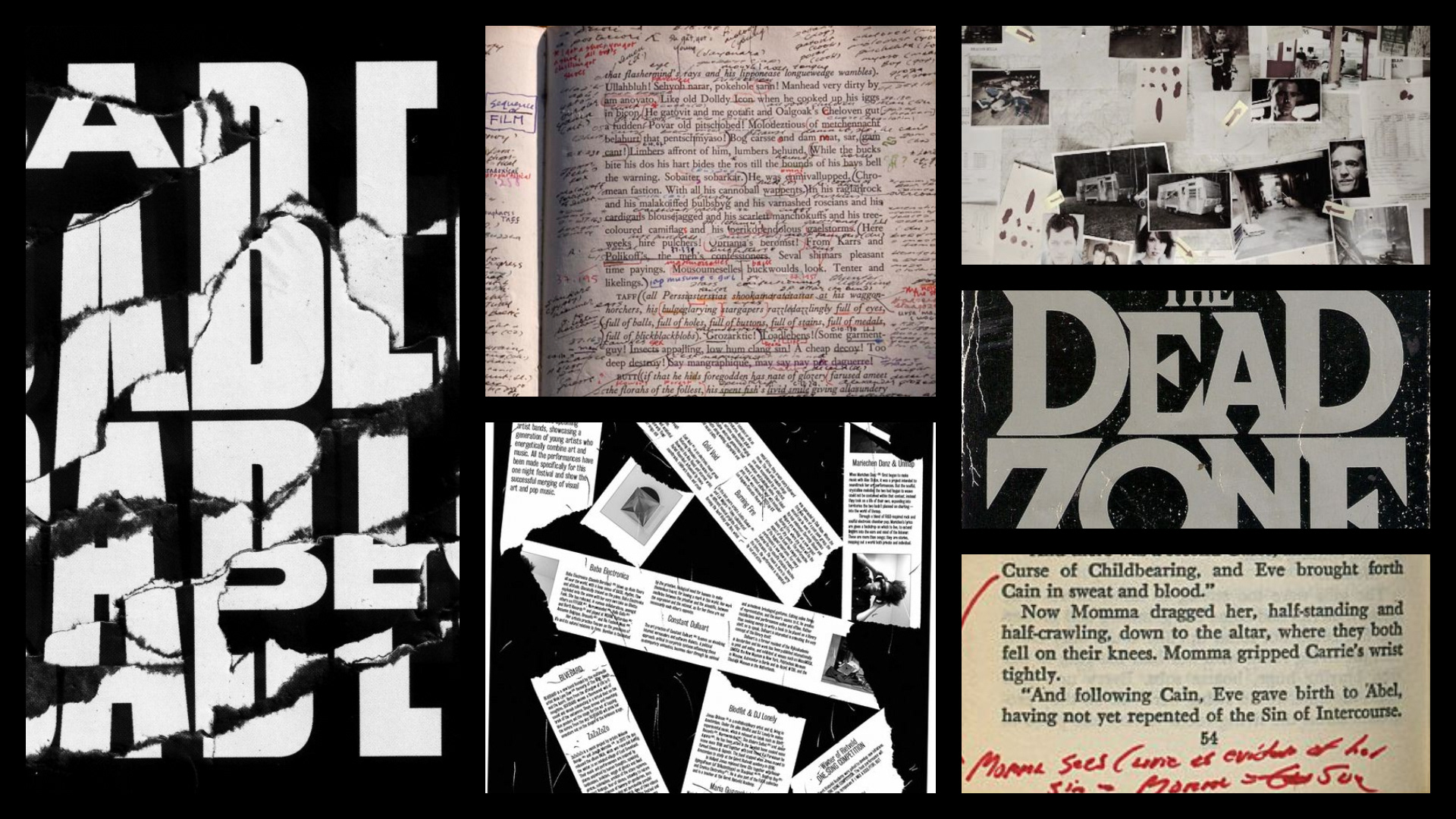
↓ FAN THEORIES & RESPONSES
Hey there, this is the default text for a new paragraph. Feel free to edit this paragraph by clicking on the yellow edit icon. After you are done just click on the yellow checkmark button on the top right. Have Fun!
↓ EXTENDED READINGS
BEHIND
THE
SCENES™
A Collection of project
insights.
Thank you for noticing. All the easter eggs.
Here's a Thank you video to all the fans. We included some of the behind the scene process we used in the actual title sequence.
↓ LOGO EXPLORATIONS
We started the logo explorations first to find a right tone for the show. Here are a selection of logos from our earlier explorations:

↓ EARLY RESEARCH
Here are few of our early references that set the tone of the direction.
↓ OUR FAVORITES

↓ INITIAL DESIGN
Our Talented Max Stritzich started with his first design that initiated the idea. Giving the borken wall aesthetics we set in our logo design, torn pages turns out to be a perfer languege here. It all started with this single styleframe. A perfect example of how an artist sees and interpretes an image in his brain. For more initial designs visit Max's site here.


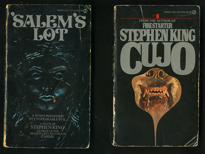
↓ PRODUCTION RESEARCH
At this stage, the overall concept of using King's paperback novels was set. Our production team went ahead to start looking for options to purchase the paperbacks. We were looking to buy used king's books just so we can study the textures of used paper and overall conditions of such books.

↓ TEXTURE SCANS
Once we received those used paperbacks we started to study their textures and scan those books to start implementing them into our designs.


↓ TEXTURE REFERENCE BOARD

↓ STUDY AND IMPLEMENTATION OF NOTES
A huge aspect of this piece is the notes our protagonist puts into those pages. Director Jeremy worked closely with the showrunners to come up with ideas for easter eggs. Hinted at everything that involves the town in King's selection of stories and whats to come in the show.


I work remotely and often travel between New York City and TAIPEI. Right now I'm currently in:
→ If you want to stay updated of my work, follow me on Instagram.
You can also contact me at:
henrythechang@gmail.com
Henry Chang - 張亨利
henrythechang@gmail.com
+1 (912) 401-3305
Copyright © 2020
All Rights Reserved By @henrythechang.